Showing posts with label Nisha Haq Photography. Show all posts

Monday, 5 December 2011

Nisha Haq Photography > The Kiss 0.2

It's been a while since I did a post on my work. This piece of work is a GIF and I've only experimented with creating these only on a few occasions. Though they look rather simple there is quite a lot of work involved! I made 'The Kiss 0.2' for a short project at uni (BA Photography at Southampton Solent University) to do with time. I was thinking of a few ideas and thought I'd revisit a shoot I did this Jan. 'Kiss Me Kay' (Jan 2011) are stills from a video I made. I was experimenting with time lapse and the subtle differences in each frame in a kiss, a simple act with so  many expressions. For my current time project I wanted to have a slightly different twist but fundamentally have the same basis for the idea. This time I shot outside against a fountain background which was also on a time loop for when the water would shoot out. I also used a tripod so all the shots can be level. Thinking about when to shoot and wait for the fountain all involved calculating correct timing and using a very fast shutter. I shot on continuous shoot mode and as it was outside I could shoot at a fast shutter at a low ISO so more detail. 

To create the image I first resized all the images to 600 pixel width and saved the images again using Fastzone Photo Resizer software I downloaded for free from the internet. This meant I had low risk of Photoshop CS2 crashing due to uploading a lot large images. I then edited the first photo and saved the actions I did to it to apply the action to other photos easily. I added contrast, a few colour filters, soft Gaussian blur and used the sharpen image filter. I opened all the photos I wanted to use one by one and replayed my 'The Kiss' action 26 times. Now all my images were ready to use. I then created a Photoshop document to create my gif. This involved opening all the edited images and simple placing the images on top of each other. I opened the 'animation' window, the tool to use to create gifs. I then selected all the layers and chose the option 'Make frames from layers' from the small arrow on the right of the 'animation' window. I then selected all the frames and chose 0.2 second delay from each frame to the next. To save as a gif I selected 'Save for Web' and chose GIF format, not JPEG.

Here's the image I created: Tell me what you think? Being relatively new at creating GIFs I'm quite happy how it turned out.


M.A.S.H


Tuesday, 5 July 2011

Lookbook > Death by Stripes

I recently did a set of self-portraits (May 2011) originally intended for my Chair A2 Photography project but never got round to editing them in time for the deadline. I sifted through this shoot which I wasn't too happy about but managed to find some editing-worthy photos out of the 250ish photos I took!

I thought these shots were worthy of a Lookbook.nu entry... so Hype / Like it if you like this style!


About This Look: I decided to wear my zebra print dress as I wanted to play the role of a hunted down prey, a zebra, with a fashion twist especially as zebra print is in season this summer. The papers on the floor represent the endless work that is 'killing' me and the chair signifies the countless hours sat down working (on that particular chair).

I have yet to wear this dress out in public (give me an occasion to wear this to!) plus I would like for this to be tailored in as when I bought it online from boohoo.com it was a little big. ... Can a zebra change it's stripes.. hmm?

Anyways Hype away ppl! haha btw, you can check out more photos on Flickr from this set: http://bit.ly/my8sCF

Friday, 24 June 2011

Nisha Haq Photography > The Secretary's Chair

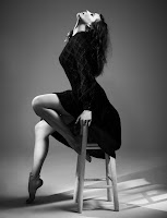
For my Chair project (March 2011-) I first focused on fashion photography and using the chair as a prop for various fashion shoot. After all my fashion research I decided to finally shoot in the studio drawing inspiration from Willy Vanderperre’s photos of Lara Stone and Liv Tyler, Giovani Squatriti of Caterina Murino and Nick Knight’s Then Now Next feature for i-D magazine. I liked the simplicity in all these shots and their use of black and white. I have recently done a lot of photos in colour and thought it would be nice to return to the wonders of greyscale. I also decided monochrome would suit these photos better as the outfit I chose for my model, Lauhren Jones would stand out much better especially as they were black and white clothes. I did this shoot in March 2011 in my college photography studio.

 
I was inspired by the Chanel look and with a classy translucent material Asos blouse teamed with a bow tie (M&S), high heeled lace shoe boots and elasticated black mini skirt from New Look with hold ups and stockings (vintage); I wanted to fuse elegance and sexy which lead me to the idea of a secretary especially after looking at this film poster from 2002. I wanted to play on office fantasies and stereotypes of female secretaries whilst retaining the fashion element. On some of the shots I didn’t want them to be too sexy and wanted to portray an easy going lady despite the constricting garments.

FACEBOOK   /   FLICKR   /   TWITTER   /   MODELMAYHEM

M.A.S.H

Monday, 20 June 2011

Nisha Haq Photography > Dood Looks Like A Lady

One of my most interesting and 'daring' shoots I've done to date. For 'Dood Looks Like a Lady' I decided to get my fabulous gay friend, Matt Giles to dress up as a transvestite for a an hour for my Photography chair project. After continuously seeing how the androgynous look is very in season (especially after the Andrej Pejic case of modelling both females & menswear) the fashion world is becoming more accepting and even promoting this fashionable 'transvestite' trend. This particularly intrigued me where I wanted to explore themes of burlesque styling with a modern 'twist'. I linked this in with my chair project as burlesque dancers often use a chair as part of their act so thought I'd mix these themes up.

For this shoot (shot in March 2011) I dressed Matt in my lingerie (was really funny doing this) with the aid of Lauhren Jones for dressing and some make up. I had asked him to bring in a wig just in case however chose not to use it as his neck length conditioned hair looked very silky and feminine anyway! Despite being very rushed for time as I could only book the college studio out for an hour I only had 15 minutes of good shooting. I thought Matt was a great first time model (especially in clothes out of his comfort zone!) and certainly worked the studio space and followed direction very easily. Here are some of the edited shots from the day:

Check this photo out on:     Flickr    /    Facebook


Nisha Haq Photography & Design Links:

M.A.S.H

Wednesday, 1 June 2011

'Buy Your Own Burka Barbie' Graphic Design Posters

Hey Guys
It's been a while since I've posted my work on here and being a person who likes things in chronological order I couldn't post recent works until I posted my old ones (I really should get a hold on things!) So I traced through my Flickr photostream to see what the last piece of work I posted on my blog and realized I haven't blogged these pieces.

Burkas, Barbies & Banning

'Buy Your Own Burka Barbie' was created for my A2 Graphic Design final piece 1 coursework for college (there are 2 final piece coursework modules.) I created these in January 2011 (photo was taken Nov 2010).

Burkas
This piece was submitted for my Identity/Feminism project where I looked at aspects in my life, how I identify with them and my strong views & beliefs. I wanted to look into my Islamic roots (my grandparents are very religious), self-portraiture and what that meant to me. I had intended to just do a self-portrait (see below) but was lacking inspiration on how to go about it. I had submitted this as my first final piece until I realized I really didn't like it and had a typical general message that didn't really identify with me.
I was surfing the internet looking for inspiration and came across Shadi Ghadirian's 'Like Everyday' photo series which looks at the role of Islamic housewives in many Arab countries. Some may say this is stereotypical, I say it's realistic. So 'Like Everyday' and looking at burka Barbie dolls on Trendhunter.com inspired my final piece coursework. I do think Islamic women are oppressed especially in the Middle East (though this is just a generalisation, not all women!) and their voices are left unheard.

Barbie
I decided to create these posters linking in with Barbie, a Westernized concept of beauty and the perfect woman; also Barbie represents global corporate branding. I wanted to look at how women in Islam, in particular housewives are seen as dolls in the sense that they are the 'property' of their husband and are told what to do without a say in the matter including sexual demands. I wanted to portray these themes in this poster with a stereotypical 50's Western housewife advertising style including the catchphrase 'I'm your Real Life Housewife!'. The tagline 'Available in all men's stores for only £1.99' meaning how cheap, easy & accessible it is to get a wife like 'me'.
Whilst creating this design (both posters took a whole weekend of work) I heavily airbrushed and 'Photoshopped' my face to make myself look 'doll-ish' but still human. I wanted the surface to be bright and colourful but with a sarcastic note to it, addressing heavy concepts with a flavour of dark humour. I didn't want to be too provocative, just enough skin showing to communicate my concepts clearly and of course the burka relating to Islam.
(FYI, no copyright infringement intended on Barbie!)

Banning
I had this work exhibited in one of my college's corridors and stayed there for a few days until it was suddenly taken down! At first I thought it was because the college was clearing the space for more work to be exhibited but was unusual that only my work was taken down and my friends work in my graphics class still remained on the walls. I lead myself to believe that the technicians got tired and hadn't gotten round to taken the other work down... but of course that wasn't the case! I had to enquire myself (unfortunately the college didn't have the decency to tell me themselves) why my work was taken down. It later came to my knowledge that my work was TOO CONTROVERSIAL!! The principal had apparently voiced concerned that it wasn't 'family friendly' and subsequently was taken down for open evening where all ages were welcomed to attend. At first that seemed shocking for the bad reasons that I couldn't exhibit my work any more, then I realized to some extent is a weird sort of compliment that my work was too controversial (meaning my message obviously came across!) and as a graphic designer is a good sign to cause such a reaction (I hadn't considered these posters to be controversial or using shock tactics as such until now). The only problem I had about this incident was that I wasn't notified (especially as my work was exhibited in an educational establishment, not a public place which is understandable) and the poorly explained reasons behind it. I think people should hear about these issues and if 16+ year olds are going to study at college should know what they're getting themselves into! (sorry for all this banter.. sometimes the blogging takes over me!)

Anyways... here are my posters! Tell me what you think!


I really liked the background typography and the effect of the texture so decided to make a typographic version with an outburst of bright colours. I also used the 'Barbie' logo font to make my posters more realistic. I particularly like the use of lens glare on this poster, it's such a handy tool to use in Photoshop! I think these posters look really effective A2 plus. When I printed it out on glossy on A2 size paper I was shocked looking at my own face! haha, Never seen it so big before!


Please note that I do not intend to hurt, target or upset anyone, only simply to communicate my views in an artistic form. I do not wish to spread hate or anger just bring to light issues in today's world. Hope you can respect that.

M.A.S.H

Wednesday, 25 May 2011

Flickr Pro Account, Twitter... and more changes :D

So I've upgraded my Flickr account to a Pro account! woop, so now I can feature all my photos (unlike before where only my recent 200 photos were shown) and organize my photos better :) This means I can keep on top of my photos which will help me post my work here! I've also organized my sets of photos into chronological order! woop, ( I may be a little too happy about this! haha) Like I have said many times before... I will post regularly on here 'cause I love blogging so shall defo' keep up to date with this!..  I WILL!! haha


I've also just got TWITTER!! haha so follow me if you want to keep up to date with my banter.. (haha) twitter.com/nashdood and other general shananigans that relate to photography, art, music, and all things M.A.S.H!


I'm also thinking of re-vamping this blog and make it easier to navigate and more simplified... plus I have still yet to create a banner/logo for this blog!!! So changes shall be made here as well!

Loads of new edits to post... coming very soon! woop woop :D

M.A.S.H

Sunday, 22 May 2011

Sold My First Prints!

Was pretty excited to sell my first photo prints today of Jake Morgan (from my chair series) and the hard work certainly had its rewards. These were 2 7x5" and 1 14x11" prints and were also sold with a thick black frame and I think looks great!

See the originals here: http://www.flickr.com/photos/mashnashphotography/sets/72157626751461084/

Thank you for buying my prints!

If you would like to purchase any of my prints please send me an email at nish.nash@sky.com.  As of May 2011 prices vary from £6-£45 (but may vary) so get them quick! Prints vary from matt & satin finish on high quality photo paper with option with of a frame and I can also print on canvas (but can vary so get them quick!).


M.A.S.H

Friday, 20 May 2011

'Open Wide' Graphic Design Poster

One of the main reasons I started this blog was to post my work like an online journal of work however lately I've been drifting away from this and have been lazy posting my work! I mainly use Flickr & Facebook for regular updates on my work but there is still much to post as I'm always work on new projects, edits and shoots.

This edit I did all the way in January 2011 for my 'Feminism' project for A2 Graphic Design course at college. The background image was taken in October 2010 and the mouth image I shot in Jan 2011. In this poster I wanted to show how females can be portrayed and how they are 'sex objects' and all a woman has to do to please a man is 'open wide'. If you can't see what the background image is, it's basically my legs 'open wide'!

click pic to see bigger


M.A.S.H

Tuesday, 17 May 2011

18th Birthday Today!

Hi Guys

It's been a very long time since I've blogged an entry! gah, sorry guys but now that I have a little time off from exams I have some time to blog more! yay

I've done quite a few things since the last entry such as my first Wedding, Photography & Graphics exam, few University Interviews, volunteering projects a few live events and loads of photo shoots . But of course the most important thing that has happened recently is my 18th BIRTHDAY TODAY! woop woop

Had a few friends sleepover last night and went to the cinema to see Priest, which was okay but the effects were pretty good. Also my super aweosme mother took me out on Saturday and we had a fun happy day (which made me realize I definitely don't feel 18 yet!) I'm excited to go out drinking and clubbing for the first time legally! haha

So I'll leave a few photos of what I've been up to and what to expect PLUS MUCH MORE! some of these photos may feature a chair/s which has been for my photography exam project on chairs!... this time I'm going to try much harder to post regularly. Also thinking of a blog make over... new logo design, layout background.. the whole sha-bang!


Monday, 21 March 2011

Street Style > Black Blazers & Boots


Taken: 3rd Nov 2010, London Oxford Circus (outside Topshop)

Street Style > Camel Knitted Jumpers


Taken: 3rd Nov 2010, London Oxford Circus (outside Topshop)

Street Style > Farmer Quilted Jackets


Taken 3rd Nov 2010, London Oxford Circus (outside Topshop)

Nisha Haq Photography > Ady Winter Canal Shoot II

So you may have seen part I to this post and now I've done some more edits from this lovely shoot with the very lovely Ady Endicott. :D taken 12 Dec 2010, edited Jan 16th 2011.

For these edits I was listening to Rihanna's 'What's My Name' song and felt like putting some of her lyrics in using Bebas Neue font.


M.A.S.H

Typography 'Who Needs Helvetica' Posters

For my previous Graphic Design project I explored typography and felt like creating a bold colourful poster. I usually use my own photographs and mix typography within the image but this time wanted to focus solely on the type and message more. I was browsing the internet and kept seeing everyone praising Helvetica and wearing t-shirts, making movie documentaries etc and wanted to give the other typefaces the limelight! (hehe)

I think Helvetica is a great font and has revolutionized graphic design, typography and the way we read in public places. As I don't have this typeface I thought I'd show my appreciation to two of my favourite fonts, Bebas Neue (from Dafont.com) and Georgia (a free font with Microsoft and a web standard font). I constantly use these fonts and think they're great and simple.

For these edits I wanted to jazz it up and create an almost 3D effect when you look at it. I also added a small textured border to draw you into the font. Hope you like it! Just random fun editing on Photoshop CS2 :D


M.A.S.H

Monday, 28 February 2011

Inimtacy Photography Project Final Pieces

Hey Everyone.

I put doing a fair amount of photography work with new projects and shoots. This entry will focus on my final piece prints for my A Level Photography course. This project I looked at intimacy and the different ways it can be portrayed photographically. In the end I decided to create a mock magazine 'Obscura' (as in Camera Obscura, Latin for dark chamber aka a camera) and create very minimalistic alternative front covers. I used photographs I had edited from this project as part of my final piece and presented it in magazine layout with little text so more emphasis was on the images. Tell me what you think (btw, I got an A for this project! Woop!) :D


M.A.S.H