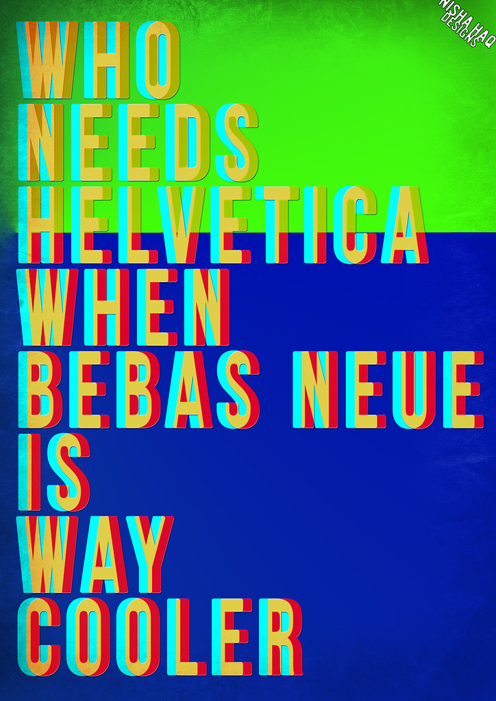
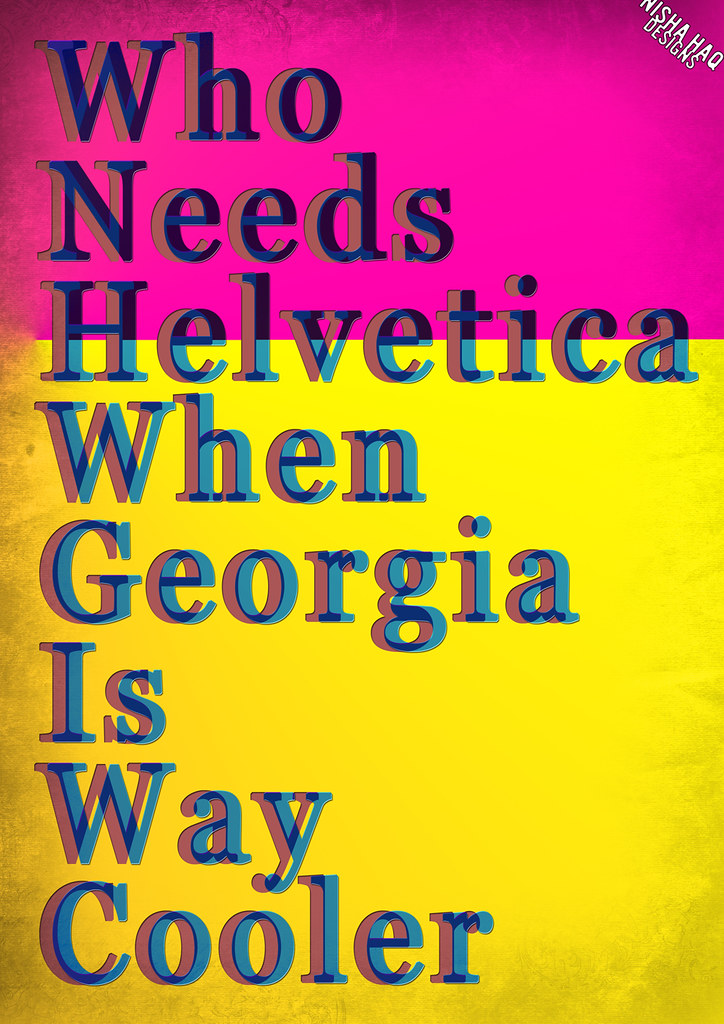
For my previous Graphic Design project I explored typography and felt like creating a bold colourful poster. I usually use my own photographs and mix typography within the image but this time wanted to focus solely on the type and message more. I was browsing the internet and kept seeing everyone praising Helvetica and wearing t-shirts, making movie documentaries etc and wanted to give the other typefaces the limelight! (hehe)
I think Helvetica is a great font and has revolutionized graphic design, typography and the way we read in public places. As I don't have this typeface I thought I'd show my appreciation to two of my favourite fonts, Bebas Neue (from Dafont.com) and Georgia (a free font with Microsoft and a web standard font). I constantly use these fonts and think they're great and simple.
For these edits I wanted to jazz it up and create an almost 3D effect when you look at it. I also added a small textured border to draw you into the font. Hope you like it! Just random fun editing on Photoshop CS2 :D


M.A.S.H
No comments:
Post a Comment