Showing posts with label Post Processing. Show all posts

Friday, 4 February 2011

Nisha Haq Photography > Kiss With a Fist shoot

It's been a while since I posted a fashion/conceptual shoot. I've been doing quite a lot of shoots recently, just haven't gotten round to posting it yet or editing it even! There's soo many photos to sift through!

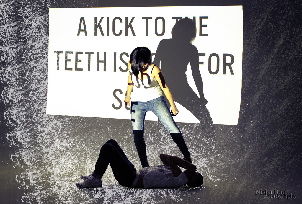
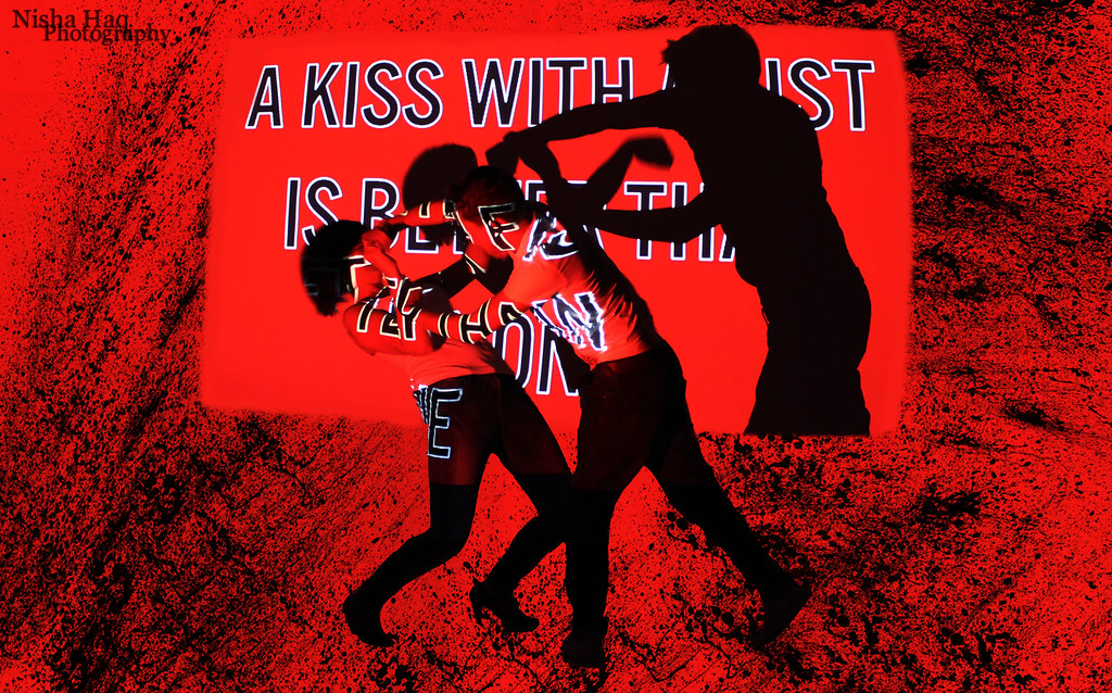
Thought I'd get the older shoots posted out of the way. :) In Nov 2010 I did a projection studio shoot with Jessica Croker and Charlie Conway. I had the idea of projecting light with typography on some Powerpoint point slides. The concept derived from an editorial in Vogue Paris, May 2009 issue called 'Game Girl' featuring my favourite model Daria Werbowy photographed by the incredible duo Inez van Lamsweerde & Vinoodh Matadin. She plays a sexy kick ass fighter and throws ninja-esque moves on guys. I love the passion in her actions and the way Inez and Vindooh captures it. The idea of 'sexing' up violence is quite interesting especially as the roles are reversed.

Here's my mood board and research page for this shoot:

I developed this fashion fighting idea whilst listening to Kiss with a Fist (see video here) by Florence and the Machine. I really liked the lyrics:

You hit me once
I hit you back
You gave a kick
I gave a slap
You smashed a plate over my head
Then I set fire to our bed

A kick to the teeth is good for some
A kiss with a fist is better then none

I projected some of these lyrics on Jessica and Charlie in my college studio and created something like this: I added brushes of paint splatter in Photoshop.


More coming soon. Check out my Facebook and Flickr :D

M.A.S.H

Monday, 6 December 2010

Nisha Haq Photography > Gustav Klimt - The Kiss recreation

Hi everyone!

I've been fairly lazy with posts for the past few days however been busy with edits and new projects and photo shoots! I've finally edited my modern interpretation of Gustav Klimt's 'The Kiss' image. For my A2 photography class assignment we had to recreate an iconic image and originally I was going to choose Steve McCurry's 'Afghan Girl' however after realizing many people were using that image as their original source of inspiration thought I'd try something completely different and choose this beautiful painting. (scroll to bottom of post to read an excerpt from my essay on why I chose this iconic image (c) Nisha Haq) Part of my 'Intimacy' project.

This was quite a fun shoot to do and I chose lovely real life couple: Lauhren Jones & Dan Ecclestone. Very kind of them to agree to this and they look adorable together here! Dan even carried a ladder to Lauhren's bedroom (she lives round the corner from me) so I could get a high above angle to shoot down. Also they were great to work with despite my often confusing direction (trying to recreate the poses in the image) they grasped the concept very quickly and got right into it which is always the right attitude to work with. Thanks guys!

Photography, Post-Processing: Nisha Haq
Models: Lauhren Jones & Dan Ecclestone
Taken: 25 Nov 2010
Location: Lauhren's bedroom
Camera: Canon EOS Kiss x4
Software: Photoshop CS2

(c) Nisha Haq

It was rather a pain to edit this considering the original image was messy with objects and unnecessary things in the picture. There was a lot of cloning and airbrushing done but I eventually got there. I realize this image isn't perfect and there could be extra Photoshopping done however as a first go I believe its ok. What do you think? Check out the before & after photo effects:

(c) Nisha Haq

Gustav Klimt's - The Kiss

Here's an excerpt from my essay for part 1 of our photography project: 'Why The Kiss is such an iconic Image':

For this project I have decided to create a modernised version of Gustav Klimt’s, ‘The Kiss’ painted in 1907-08 which is one of the most beautiful oil paintings I have seen. It’s one of Klimt’s most recognizable pieces and is the pinnacle of his ‘Gold Period’. I later saw a very iconic image by Annie Leibovitz of John Lennon and Yoko Ono on the front cover of Rolling Stone, Jan 1981 issue which reminded me of ‘The Kiss’ as the bodies were in similar shapes however Leibovitz cleverly and artistically reversed the gender roles. These two images shows intimacy, sensuality and emotion captured never before and I’m captivated by the raw beauty and how the two are very different but share similarities as well. By selecting two very famous images, one a painting the other a photograph shall give me the freedom, creative burst and the best aspects of different art mediums yet also a challenge to recreate a 21st century interpretation in my own style...
... Why choose ‘The Kiss’? There are many great aspects in this painting, one noticeably being the vibrant gold leaf he used with the oil paints and distinctive symbols and colourful flowers. This image features in my mother’s bedroom and I always find it fascinating to look at every time I walk in. The pure intimacy of the moment and how Klimt manages to paint all the small details from her shoulders hunched in from ‘breathing’ him in and embracing his sensual touch to his hands passionately grasping her jaw and head. Her feet peeping out of the elaborately decorated dress is a wonderful touch to the painting and adds character and a greater story. This theme of intimacy follows on nicely from my previous Exposed project where I explored themes of voyeurism and desire. This project will be about the softer side in a relationship and the way people connect and interact with each other.
What are your views on my new Intimacy project? Get regular updates on this project at Flickr > Intimacy Project

Nisha


Sunday, 21 November 2010

Nisha Haq Photography > Chloe Kill & Car Shoot

Had a really fun photo shoot with Chloe Hodge yesterday where I shot in Bridgwater Angel Place car park, car park where Splash Swimming centre used to be and a secluded burnt down house? near Asda. I orginally had the idea of Chloe being a Kleptomaniac (an irresistible urge to steal items of trivial value) so decided to shoot in a car park where theft is fairly common. Whilst shooting it was hard to stick to the idea as portraying someone who likes to steal and pull it off realistically, especially peeking into people's cars, it kind of looked dodgy! But I must say, Chloe was a really good on the day and a natural at modelling despite having not modelled much before. It was great working with someone who has a fabulous fashion sense (she has loads of stylish clothes especially the military trend) and having a passion for fashion like me was a joy and obviously brought out the inner model in her. She's also very photogenic and I believe this is one of my best shoots to date. Thank you Chloe!

Mood board for the shoot:

Here's a few shots that I've edited from the shoot. Still loads more to come. :D

Photography & Post Processing: Nisha Haq
Model: Chloe Hodge
Fashion, Hair & Make-Up Chloe Hodge
Taken: 20/11/10
Location: Bridgwater
Kit: Canon EOS Kiss x4, 18-55mm lens


It also helped with awesome locations, especially the abandoned burnt down house (I think it was a house, it was quite creepy). Randomly found a saw so we used that for some shots. It was great location to use for a fashion shoot, was rather excited after finding this and shooting Chloe here. More to come from this location.

This was taken at the second location where Splash used to be. A random guy from the YMCA who was waiting for people let us borrow his lovely BMW to shoot with. :D More to come from this as well

All in all, a fun shoot with many edits! :D

Here's my actions from the above photo on Photoshop CS2
NISHA HAQ ACTIONS, chloe bmw 1


Monday, 18 October 2010

Self Portrait Oct 2010

Tying in with my graphics project which I've titled 'Who Am I?' I've been doing a lot of self-portraits. Sounds fairly vain but it's more about exploration of who I am rather than trying to take as many pretty pictures of myself! This photo I'm experimenting with layers and brushes. Also thought I'd go with a more 'classic' look rather than a rough edgy look I usually do in my self-portraits. I still kept my Hard Rock Cafe necklace from NY I wear all the time, in this photo! Depending on my mood I have many styles! :)


Wednesday, 8 September 2010

Self-Portrait Graphics Edits

More graphics self-portrait experimental edits :) May use this for my A level graphic design project where I'm exploring who I am.


Monday, 6 September 2010

Nisha Haq Photography > Durleigh Bikini Edits

I've been looking through some photos to see if I can edit any more images from previous shoots. I did these today :)

Wish You Were Here
Want You Here
model: Kim Dibble

Always Seeing Double
model: Kim Dibble

I realized I haven't posted other edits from shoot. I edited these in July-August.

A Deadly Allure

Shadow My Fashion I

Wood You?
models: Kim Dibble and Lauhren Jones

Log Me In
models: Kim Dibble and Lauhren Jones

Take A Joy Ride
models: Kim Dibble and Lauhren Jones

Tyre Me Out

Saturday, 4 September 2010

Self-Portrait Pop Art Edits

I've been wanting to create interesting self-portraits for some time and thought I'd try a pop art graphic design approach rather than emotive monochrome portraits I have done many times before. I had already taken a batch of random self-portraits and thought I could experiment on those.

This is what I created in 3 hours.
L.O.L
L.O.L
 A LOL society. I decided on using famous youth acronyms which is said/written every second by people around the world. (In case you didn't know, it means Laugh Out Loud). This photo of me is all girly and sweet looking, hence I chose to put LOL underneath. I also 'clone stamped' my mouth for emphasis on LOL.

I was looking at advertising campaigns and thought of the new Diesel 'Be Stupid' A/W 2010 campaign where they've used innovative photographs and bold, bright Impact font pasted on top. This gave me the idea of using bold font for my photographs. 


W.T.F
W.T.F
This is the second edit I did and I think I'm pulling a 'WTF' face. (This means What The Fuck?) I played around with rough textures to add to the mood of the photo and also clone stamped my mouth to make look my jaw is dropping. I was inspired by Gilles Et Dada F/W 2010 shot by Federico Cabrera.

GILLES ET DADA F/W 2010

See more on my Flickr

Friday, 3 September 2010

New Edits from the Dibble Hawk Shoot II

So I've done some more edits. I admit some were edited quickly but I'll upload as a daily upload. Check out previous edits here from previous posts: New Edits from the Dibble Hawk Shoot I and The Dibble and Mohawk Shoot.

Check them out on Flickr
Phone Sex?
I experimented with vignette effects on this. Thought the title 'Phone Sex?' would be funny!

Supergirl's in Town
It was hard getting a good light balance as the primary light source was behind her however I liked the shadow effects. It gave me the 'Supergirl' idea.

Let the Sun Shine
This was a quick edit. I'm not too keen on her expression and how the jumper looks lifeless on her however I chose to edit as I liked the warm brick colour and tried out layering effects.

Friday, 20 August 2010

New Edits from Dibble Hawk Shoot I

So I've been busy editing away today and managed to edit 2 photos from the Mohawk shoot I did with Kim Dibble in July 2010 in Bridgwater. I'm quite chuffed that I actually cracked down and did some work, so all in all, I've been fairly productive with my time. Also found that listening to Michael Buble makes post processing more relaxing as well!

I want to explore many styles in portraiture photography and try to incorporate different methods and fashions. These edits have a softer touch to them and are not contrasty or dark like some of my other works have been. I didn't want to smother them with rusty textures as I wanted to maintain the soft pastel colours from the sunset shooting through the photograph. I think Kim looks really natural here and I'm really glad that I managed to capture it so quickly within a frame or two.

The fashion: Jumper, (Kim Dibble), Topshop
Lace Tights, (mine), Boohoo.com
Combat Boots, (Sophie Higgins), New Look

Tip Toe My World

I added a Radial Blur (on Photoshop CS2 above, see Filter > Blur) to create a soft spinning world effect for the background.

A Peaceful Treat
I changed the 'E' in 'Street' to 'Treat' to go with the idea that the day was a 'treat' to experience and the beautiful sunset was peaceful.

See more at my DeviantArt

Saturday, 31 July 2010

Dibble and the Mohawk Shoot

Yesterday I did a photo shoot with my Kim Dibble who I befriended through Lauhren Jones on the Durleigh Bikini Shoot. Due to beautiful tall figure and looks, it was inevitable to do another shoot together plus we both want to practice on modelling and photographing. I decided to do it later in the day during sunset as I love the angle of the sunlight shooting through the photo plus there's less people in the day after work! Wanted to have a deserted feel to the shoot, not really a 'rockstar' look, but laid back rock chick feel.

I was quite excited about doing this shoot as I simply love shooting plus I loved the theme and the day was beautiful. I do choose the best days!

When I arrived at the rendezvous point at Blake Statue in Bridgwater Town I realized there were more people that I anticipated, but it wasn't too busy so it was okay. However we did get quite a few weird looks which made Kim a little self-conscious but we overcame that fairly quickly.

The sky was souring with Azure blue with the vibrant sun at 7.00pm. It was my favourite time of day which made it that extra more fun to shoot. At first it was hard getting into the swing of things plus I realized that Kim's camera she kindly let me borrow wasn't an SLR, but putting that aside; we eventually got some cracking shots.

The first location, I wanted to get was Bridgwater Town's landmarks; the Cornhill, Blake Statue and St. Mary's Church in the background. This made Kim really stand out and look powerful with her killer heels, legs to die for and the ''Hawk'!

Here is my first edit from the shoot and at Bridgwater Town Centre:
Dibble and the Mohawk I / model: Kim Dibble / taken: July 2010

For this photo I wanted to experiment with layers and textures (the clouds is a texture, the sky was clear blue that day) and see what I could do with monochrome and posterizing the background. I like how the mowark stands out (I made her hair darker). Also someone had asked whether her legs were airbrushed but Kim is naturally that slim! Love her figure :)

You can see the before and after photo and what I added to the original to create the final edit:

And a photo from the second location was taken in a park/someone's back garden (not too sure). We still wanted to get that secluded feel so went to quieter place in Bridgwater. All the clothes in this shoot was Kim's except from lace tights and biker jacket which were mine and combat lace up boots which Sophie Higgins kindly loaned to us.

I really love the lighting in this and the direction of the sunlight was perfect. Kim looks amazing here:
Just Dreamin' I / model: Kim Dibble / taken: July 2010

I love Kim's eyes in this. I enhanced them by added saturation to give them that extra 'pop' and used a texture for the purple/navy/soft gold colours. I also cropped and repositioned this photo to make her face more central.

Here are the before and after effects on the edit:

Shall be posting more edits from this shoot. Click on 'My Portfolio' tab at the top of the page or see it on my flickr photostream on the right column >.

Or check out my DeviantArt: http://mashnash.deviantart.com/

Wednesday, 21 July 2010

Is Airbrushing Worth It?

I posted these photos below of Lauhren on Facebook to see what my friends' reactions were to an airbrushed photo or non-airbrushed of her hips and legs. I found that people thought the airbrushed photo was over-edited and that the 'real' body was better and natural. One said that ' It looks like her boobs are about to pull her down. A bit too much editing'. After reviewing these comments I realized that airbrushing is a big 'no-no' and it's best to keep to natural beauty of the human body. So why is airbrushing still acceptable in magazines especially 'Lad's Mags' ?


Airbrushed                               Non-airbrushed

One reason is that the fashion/beauty/glamour industry is all about looking good and and selling something; whether it be clothes (eg. Vogue), make-up (eg. Allure) or someone's body image (eg. Zoo magazine). Manipulation of images is always seen in these glossy magazines to make the photo more appealing and attractive however to what extend is the public willing to allow?

There has been many debates over models and celebrities looking super human and unnatural and that magazines have gone too far to sell their 'product'. Photo-manipulation has been accepted for many years since the technology has been around to create beautiful, eye-catching images such as the programme Photoshop however airbrushing seems to be a particular problem especially if someone has been manipulated so much that they are unrecognisable.

This was in the case of Kate Winslet for GQ magazine in Feb 2003 and Vanity Fair Dec 2008 shot by Steven Miesel.

Vanity Fair

Kate Winslet, now 33 years-old and mother of two, poses seductively and naked except from stockings and stilettos. When she was first digitally enhanced she was outraged and upset that women have to be airbrushed and retouched to make them look more appealing. Shouldn't the womanly figure be sexy enough without enhanced 'boobs and butt'?


The Daily Mail Online, Tv & Showbiz asked professional airbrush artist, Chris Bickmore what work has been done on the images of Kate Winslet. 
"The face: 'There is no real detail in her face. Any detail or wrinkles have been removed. There are no eye bags, contours and smile lines.
'The whites of her eyes have been cleaned up and are now a really clean, crisp white. I'd say her lips have possibly been made slightly fuller as well.'
The skin: 'Her skin has generally been retouched all over so she has no lines or blemishes at all. Her skin is completely perfect.'
The hands and feet: 'There are no wrinkles or lines or veins on her hands and feet and this just is not natural.'
The figure: 'Her back and lower body have been pinched in to make her look thinner and to give her some curves.
'Her bottom has been rounded off so it looks nice and pert. I would be very surprised if her bottom was like that naturally. Her thigh appears to have been made slimmer so it appears more toned.
'And in the shot of her sitting down on the front cover, it's possible her legs were made slightly thinner so they also appear more toned.' "

In my opinion the image looks beautiful however Kate Winslet looks glamorous and sophisticated in real life anyway and doesn't need to be excessively retouched and airbrushed.

Left: Kate Winslet airbrushed & retouched, Right: natural beauty without make-up 

Airbrushing can be heavily seen in 'Lads mags' such as Playboy, Zoo, Loaded, Maxim, Nuts etc. Female bodies look a thousand times sexier with the flawless skin, big boobs and small waists however this isn't the average female body. This is another factor that has affected people's perception on beauty and it is no wonder that plastic surgery has been in such high demand due to images such as these:


Many people think that celebrities are exquisitely beautiful however they're just human like the rest of us and the strive for perfection can be partly blamed on airbrushed flawless images of models. Shouldn't magazines show people we can relate to in some way rather than alienating the general public and almost making us feel inferior in looks. Yes, magazines aren't magazines without appealing images however when it distorts the body until it is beyond recognition we're demoralizing the beauty of the natural human body.

What are your views on airbrushing and retouching?